

SCREEN TEST TOOLS
Why Testing Your Display Matters
Very few individuals ever wonder about the authenticity of their displays. You purchase a monitor, connect it, and expect that it will be showing you the same picture as the person who created that content intended it. This assumption is rarely correct and not always incorrect. All monitors, regardless of whether it is an economy laptop or high-end color-graded studio monitor, fall somewhere on the spectrum of perfection and the degree to which that deviation affects them varies depending on your needs.
That is why display testing is conducted. An organized battery of visual tests allows you to evaluate whether your screen has issues with backlights, uniformity problems across different sections of the display, fast motion causing blur, incorrect gamma that causes all edited photos to appear dark when viewed on another monitor, or dead and stuck pixels. In other words, each test highlights a specific flaw of your monitor that helps form a bigger picture of its actual capabilities.
These tests include: Uniformity, Sharpness, Response Time, Color Distance, Gradients, Viewing Angle, Gamma, and finally Test Pattern. Stuck or Dead pixels are tested with the use of colored backgrounds, and they represent the most popular rapid testing method. Whether you are a gamer, professional photographer, movie editor, or simply a person who wonders if he or she can keep their new monitor, these tests are for you!
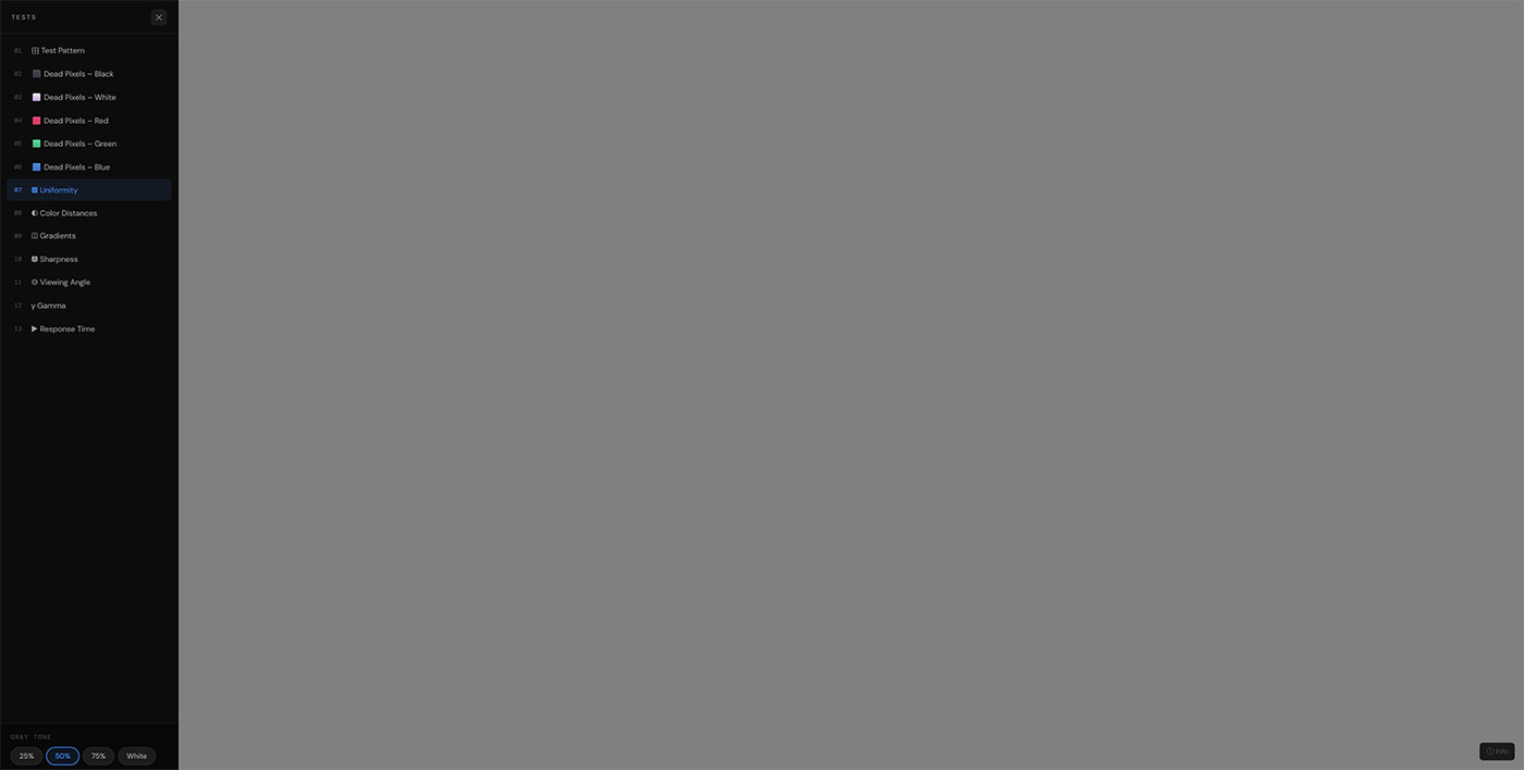
1. Uniformity Test
Screen uniformity could well be the test most often failed by consumer-grade displays, and also the most surprising one. Its logic is easy to understand; by filling the screen with a uniform solid color, whether grey, white or any other shade, one would expect all pixels to have the exact same shade. The truth is that very few consumer-grade LCD displays achieve this feat.
Screen uniformity failure takes different shapes. Backlight bleeding is probably the most common; the bright, glow-like areas found on the edges or in the corners of a screen while the panel is set to display near-black images. It is particularly common on IPS screens and happens due to backlight leakage caused by poor sealing between the backlight and its opaque layers. It’s not an inherent defect but rather an unfortunate aspect of the technology itself.
Dirty Screen Effect (DSE) is perceived as a weak mottling effect on uniform mid-grays. DSE is typical for VA-type displays and occurs due to the uneven pixel reaction on a display panel surface, not backlight problems. Unlike backlight bleed, DSE tends to occur on moving scenes, especially when there is a significant amount of uniform area covered by a moving picture like sports programs featuring football fields or race circuits.
Changes in color temperature across the screen can be regarded as uniformity problems as well. Thus, one part of the screen could look warmer (more yellow), while the other appears to be cooler. The difference arises due to the fact that LEDs forming the backlight of a screen emit slightly different colors over the entire length of the strip. This effect can be observed even with top-tier models, but it is so subtle that it can barely be noticed in real-life situations.
HOW TO INTERPRET RESULTS: The results generated by professional software for measuring uniformity consist of the luminance difference (dL*) and the color difference (dE) between each measured area and the screen center. If dE does not exceed 3.0 for the comparison between any screen area and the screen center, the result is acceptable. Any difference over 5.0 is easily recognizable in typical lighting conditions and signals a faulty screen uniformity.
The IPS glow effect deserves a separate consideration. It manifests itself as a shimmer in the corners of an IPS screen when it is observed in a completely dark room from certain angles. It is important to note that this phenomenon is not a flaw; rather, it is a characteristic feature of IPS panels, which should not cause any inconvenience in well-lit rooms. To decrease its visibility, you should lower the brightness of the screen and move back.
OLED displays address uniformity issues completely differently. Because OLED pixels emit their own light, they have much better uniformity performance across the entire display area. There is no backlight that can seep out or cause hot spots. The downside, however, is burn-in. Static elements in the interface such as the task bar or icons on the desktop could result in a ghost image that stays permanently on the screen due to the burn-in effect.
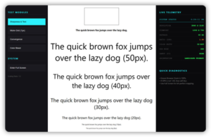
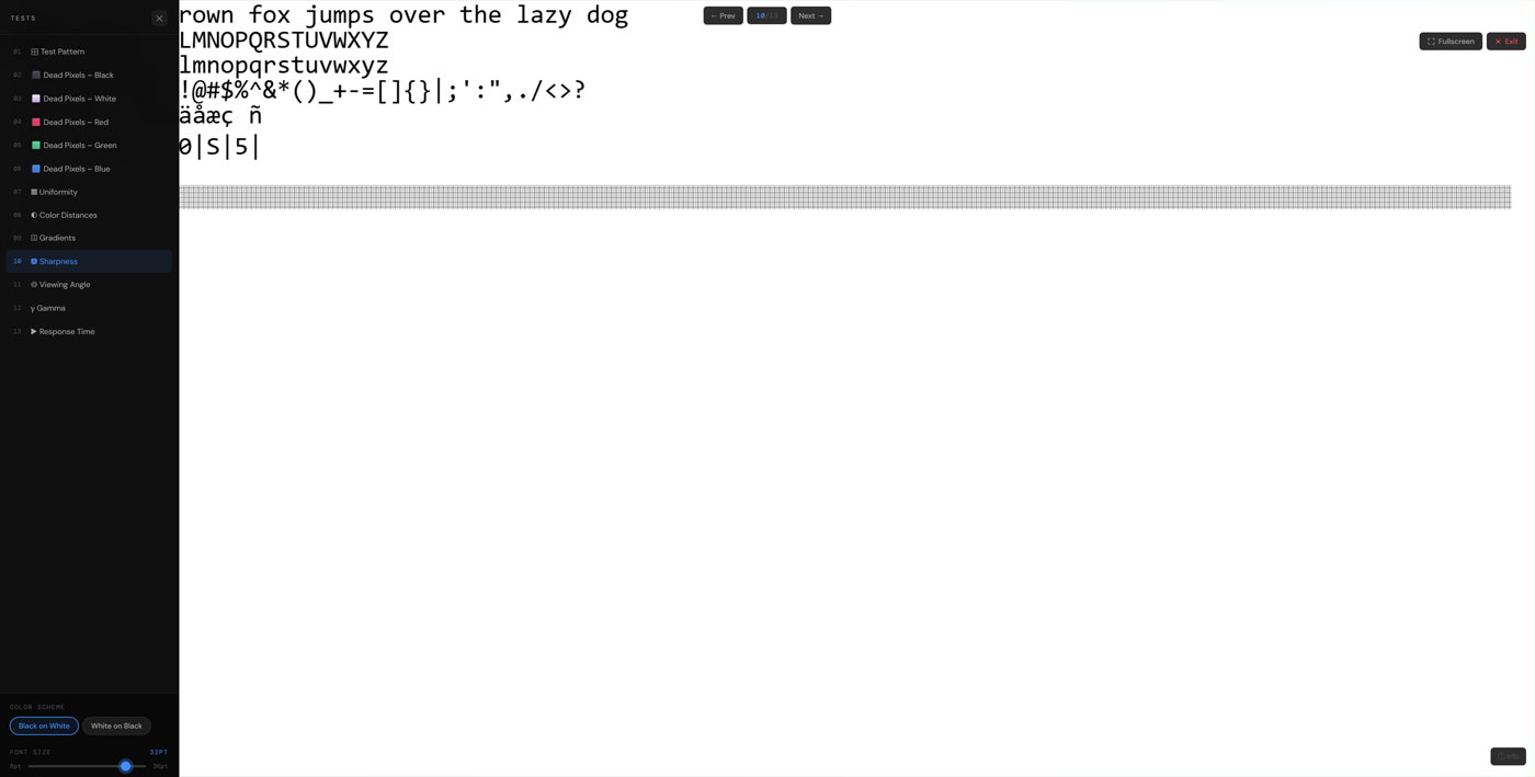
2. Sharpness Test
Sharpness does not just mean high resolution but means how well the display reproduces fine detail in its images. This can be measured by checking if the display properly displays text, grid lines, and sharp geometric forms without any kind of halo effect or blurry images.
In the sharpness test, the display is shown a series of grids with fine lines, geometric shapes, and other forms that challenge the display’s capacity to reproduce each individual pixel accurately. This would mean that there is evenness in the lines, no double pixelation, clear text without shadows in letter outlines, and true circular forms with no facets on their edges.
Over sharpening is another type of issue commonly seen in LCD monitors. Most manufacturers provide a sharpness enhancement filter in their monitor’s OSD menu, which tends to be overly aggressive out of the box. Over-sharpening causes halos, or a ring of light around the edges of the object that gives them an unnatural appearance. Halos tend to get tiresome during long-term use. Sharpness is a simple test for detecting halos – when you observe thin line edges glowing or having some halo, lowering the value in the OSD should resolve the problem.
On the other hand, sub-pixel rendering errors manifest themselves in blurriness or colored lines on top of fine text or graphics. Incorrect sub-pixel rendering settings in your OS or displaying the screen at a non-native resolution cause such artifacts. Never use a resolution that is not native to your monitor. Using non-native resolutions means using interpolation techniques, where the display needs to guess the pixel colors based on existing information. That means no matter what quality your display has, it will inevitably suffer from blurriness.
In laptops and cell phones, sharpness is also associated with the resolution density of pixels, expressed in pixels per inch or PPI. A 1080p screen on a 27-inch monitor has a resolution of roughly 82 PPI, which is good enough for viewing from normal desk distances but not as sharp as a 4K or high-DPI screen at that distance. An average human eye can perceive pixels at the resolution level lower than 90 PPI when viewed from 24 inches away.
3. Response Time Test
Response time happens to be the single most confused specification in the whole of the display industry, and manufacturers have done nothing to help clear things up. The figure you see advertised on any monitor’s specifications, 1ms, 4ms and so forth, represents the time taken for a single pixel to reach from one gray level to another under the best possible testing scenarios. The actual performance on average is always much lower than the advertised performance.
The response time specification is basically a measure of how fast the molecules of the liquid crystals contained in a pixel rotate to enable light transmission. If the rotation rate is low, there will be an overlap of images since the pixels won’t get enough time to rotate when objects move across the screen. The result of such an overlap is that an image follows the other in motion.
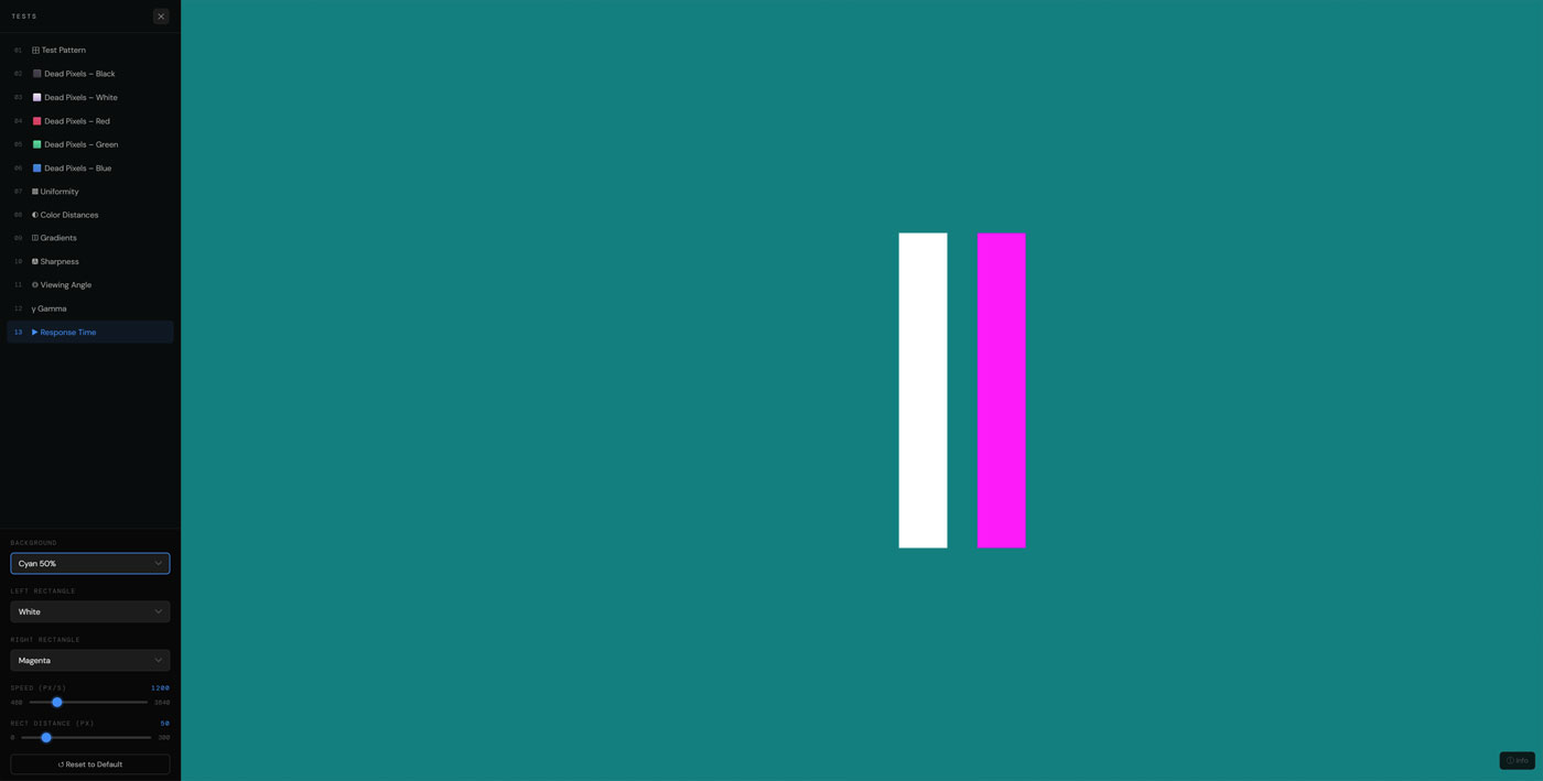
GtG vs MPRT: The Gray to Gray (GtG) measurement tests how fast a pixel switches from one level of gray to another. The Moving Picture Response Time (MPRT) test checks for motion blur, taking into account the natural sampling and holding process in backlit LCD technology. Although the MPRT test is more realistic in terms of the viewing experience, the GtG is what all manufacturers use.
In the response time test, moving objects like a brightly-colored object on a dark background are presented to the viewer in different velocities. Through the appearance of trails after the object’s movement, one gets to see how well the monitor performs when reproducing images with motion. The presence of very short and barely noticeable traces of motion at high velocities should be expected. An extended ghost-like trail following the moving object implies that the screen will not do well when showing rapid motion as seen in action movies and fast games.
The display type is one of the major factors that determine the response time of a screen. Twisted nematic screens were the fastest, having the best response times of about 1-2ms GtG. However, this technology prevailed over other types due to its low cost despite lacking color accuracy and narrow viewing angles. Today, fast IPS panels have significantly narrowed the gap between them and TN displays, with their 1-4ms response rate being faster but with better color representation and wide viewing angles. The VA panel has the lowest response time among the three types, especially during near-black transitions.
Overdrive, which comes with names such as Trace Free, Response Time Enhancement, or AMA, among others, depending on the brand, is applied to increase the voltage and hence speed up the pixels’ transitions. When used wisely, Overdrive helps to eliminate ghosting; however, when applied too much, it results in inverse ghosting, where a white ring shows up just ahead of moving images because the pixels are going overboard with their required transitions. In the process of testing the response time, one is able to get the best level of overdrive for the screen.
4. Color Distance Test
The color distance test tests the ability of your monitor to discern between colors that are similar. It does this through Delta E, which is a measure of how far apart colors seem from one another as perceived by the human eye. An effective monitor will be able to discern between two similar colors. An ineffective monitor will show both of these colors as being identical.
This means that during the test, two color patches next to one another will be shown, with an adjustment bar that enables you to make the colors increasingly more similar until they appear indiscernible. At the exact moment where you cannot tell whether the two patches are different, it shows your screen’s color resolution. When performing this test on two screens, differences can quickly become apparent when viewing the two nearly identical colors next to one another.
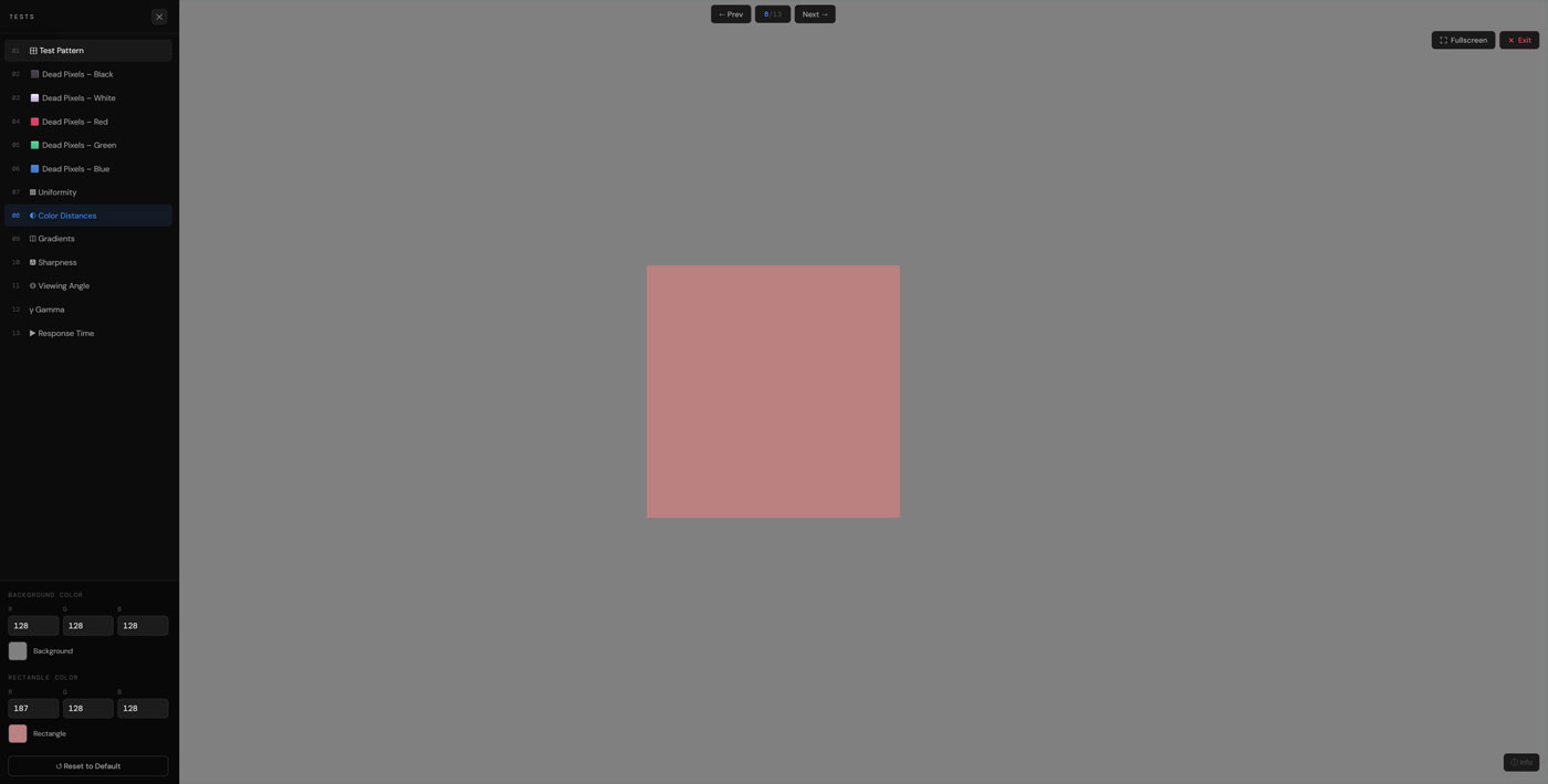
The threshold of human color perception is Delta E equal to 1.0 — all differences smaller than that are imperceptible by naked eyes. For professional color grading monitors, achieving dE of less than 1.0 throughout the color gamut range is the aim of its design. Quality consumer-grade monitors manage to obtain color distances of less than 3.0 when calibrated properly. Lower-quality panels can have dE higher than 5.0 in important parts of the gamut, so colors that seem distinguishable in reference will be indistinguishable on screen.
One of the typical trouble spots includes areas near black and white. Panel bit depth limitations lead to tones that should be distinguishable blending into each other, resulting in shadow details being crushed and highlights blown out. Another place that is likely to suffer from bad color distance performance is skin tones. Faces with complex coloring become devoid of any variation and look dull and homogeneous. Color distance test reveals these problems in a straightforward manner.
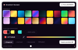
5. Gradient Test
A gradient test shows a gradual change from one color value to another, normally from black to white or through all colors, and challenges you to see if your display can display this gradient without noticeable steps, bands, or breaks. If the display works correctly, an 8-bit display will provide a flawless display that is completely seamless.
By far the most common type of error in gradient tests is called banding. This happens when the display does not have enough steps between the two colors, making the image appear to be striped. The difference between a true 8-bit display and any other is that it displays 256 levels of colors in each channel, providing plenty of options for visually smooth gradients in all types of content. Displays that use six bits for color channels and utilize techniques such as dithering and FRC show subtle banding in highly saturated areas like blue skies and skin tones.
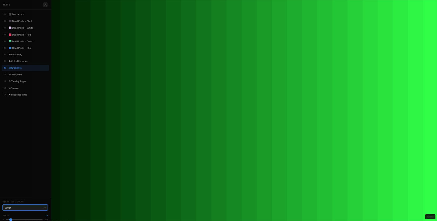
Monitors that are used professionally have 10-bit colors, which have 1,024 levels for each channel. The difference between an image rendered using 8 bits and one with 10 bits is easily noticeable when it comes to gradients, since there will be no banding at normal distances with the latter. Photographers and videographers who use RAW and HDR materials will notice the effect of additional bits.
VIEWING DISTANCE MATTERS: To conduct an accurate visual gradient test, move slightly away from the computer monitor and observe from your usual working distance. It is because the natural tendency of the eye to average out adjacent pixels causes any banding effects to become more noticeable from further away rather than closer up.
Noise in gradients is another related yet different issue. There are some display panels which use the technique of dithering to reduce banding due to lack of bit depth. This results in noise in the form of grain, when done wrongly, especially in the smoother parts. The smooth darker background or shadows in images tend to have this sort of unpleasant look, which is not found in the original image at all.
6. Viewing Angle Test
The viewing angle test demonstrates how sensitive your monitor image performance is to moving away from that perfect center point where the display performs its best. The reason why this test is important is because nobody ever sits in that perfect middle spot all the time – one will always shift his/her position, sit next to other people, use the monitor from various positions and angles, etc. Knowing how your particular display handles such positional changes gives you an idea of how well it works while doing regular stuff.
The viewing angle test usually presents geometrical figures at different offsets both vertically and horizontally, letting you see firsthand how much of size, shape, brightness, and color shifts when viewing your display from other angles. The better the display, the less noticeable the shift should be.
TN panels have the worst viewing angles compared to other mainline LCD technologies. Viewing TN monitors from under the bottom of the screen causes dramatic changes of image quality due to a dramatic color inversion. Dark colors become lighter and vice versa; colors themselves are very different from the original values. This can happen even when viewing a TN panel at a relatively small vertical angle, around 10 to 15 degrees.
For IPS panels, viewing angle issues were less severe and included color stability in a large horizontal angle range and decent vertical viewing angle stability. That made this display technology preferable to TNs for professional use. The only problem of viewing IPS panels was the same as with uniformity – a glow caused by viewing dark content from a certain angle.
VA panels sit in the middle range. They have good contrast ratios, but these do not maintain themselves very far off-center, with gamma changing noticeably as you move away from center. There may be a color shift as you move to the sides, along with an alteration in black levels that will change the tone of the picture. Again, OLED leads the way in angle of view, with colors, luminance, and gamma all staying the same over incredibly wide angles since light is emitted from self-illuminated pixels.
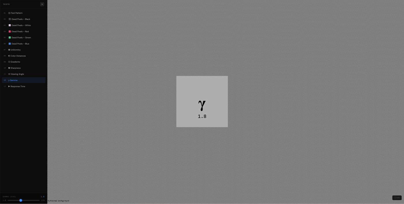
7. Gamma Test
The value of Gamma refers to the connection between the value represented in the number of a particular pixel in the image file and its corresponding brightness displayed on the screen. Gamma 2.2 is the standard gamma in the industry that is used in the color space known as sRGB, the color space of the internet, games, and majority of other consumer media products. In a gamma 2.2 setting, a pixel that uses half the possible maximum value will produce 22 percent of the maximum screen brightness, not half of it. This deliberate non-linear approach has been adopted due to the nature of the human eye.
Human eyes are much more sensitive to brightness differences between dark tones compared to brighter tones. This means that two similar shades of dark gray tones can be distinguished easily whereas the same amount of difference between bright shades cannot be detected. Therefore, Gamma 2.2 devotes more digital bits to darker pixels compared to brighter pixels as humans can detect differences more easily between dark tones than bright tones.
WHY THIS MATTERS FOR EDITORS: Images get made on the understanding that gamma value for the viewer’s display device would be 2.2. However, if your screen is working under gamma 2.0, the images you produce would end up looking brighter than you had intended them to. And once exported to properly calibrated displays, the images come out darker than expected.
The gamma test shows dithered or striped patterns at several luminance levels, each next to a single mid-tone patch. As the name implies, when you observe these from a normal viewing distance, the eye sees the averaged brightness of the fine structure in addition to the uniform brightness of the patch. If the average brightness of the pattern equals the brightness of the patch, then your display gamma at this luminance level will be equal to the gamma value in the test setup. Ideally, a calibrated monitor will exhibit 2.2 gamma regardless of the luminance level used – including at mid-tones.
Consumer monitors typically ship with a gamma value of about 2.0 to 2.1 due to their brighter appearance in the brightly lit showroom. Gaming monitors often intentionally aim at a lower value of 2.0 for better visibility in low-light environments. These values may be appropriate for certain applications but are unacceptable for tasks like photo or video editing when accurate tonality is important. The problem with per-channel gamma mismatch occurs as a result of a different response characteristic of the three color channels, leading to a noticeable color cast in shadows and highlights.
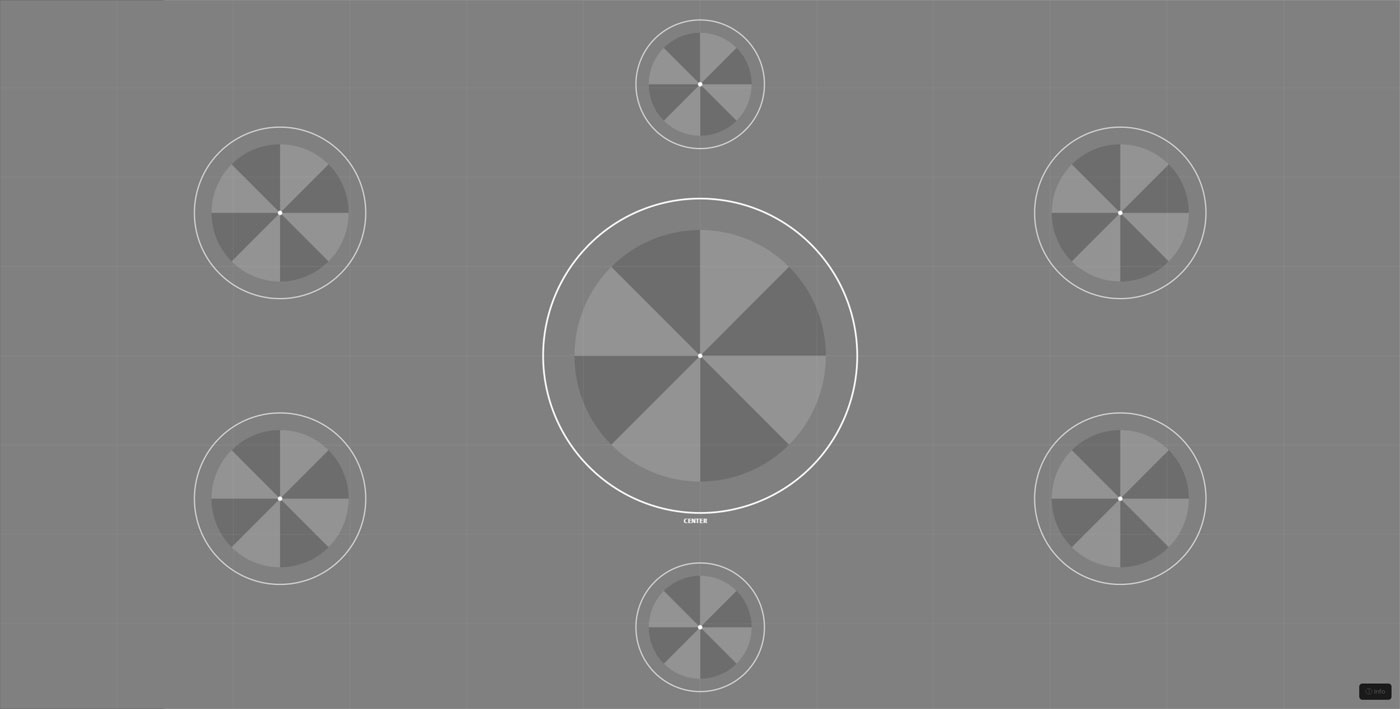
8. Test Pattern
A full test pattern is the ultimate diagnostic suite for display testing. Instead of focusing solely on one attribute, the test pattern is a well-rounded test pattern that allows the seasoned eye to see various attributes at once and then focus on individual tests later on.
A common test pattern should have concentric circles that are used to measure geometry and aspect ratio, a series of high-frequency line density tests to discover the limits of sharpness, a color gradient chart for the analysis of smooth tonal transitions, corners and edges to test uniformity problems, and pure blacks, whites, and grays to gauge contrast ratios and brightness.
Circles help in more ways than one. They determine if the display is using the right aspect ratio; an elliptical appearance of the target means that the display is operating at an incorrect resolution or a non-native resolution. They also help identify any kind of geometric distortion at the screen’s edges, especially when it comes to big curved screens since there is slight distortion near the edges of the curve.
Frequency patterns, which consist of black and white stripes at increasing levels of density, can be used to determine how well the screen can resolve images. For example, at high levels of density, if the monitor cannot resolve all the details within a certain image, it will combine the stripes into a single gray line. Thus, frequency patterns will provide an indication of where the resolution on your screen is limiting you.
It is advisable to start every testing session by using the test pattern. Not only does it provide a general idea about the capabilities of your screen but also allows you to identify what tests need your focus. Furthermore, it provides a benchmark against which you can observe changes after calibrating or making adjustments to the OSD settings.
Pixel Testing with Solid Color Backgrounds
The most straightforward method for checking whether there are any defects in the pixel level has remained the same since the beginning of LCD monitor technology — the monitor should display a single-color solid image, and then the observer must find any dot that does not fit the general color background of the display. Such an approach utilizes one of the main characteristics of stuck and dead pixels, which means that these dots are set to one constant color, regardless of other pixels displayed around them.
Each color serves a unique purpose — pure white screen is used for revealing dead pixels; it means that their transistors cannot be activated by electricity, so they show nothing but black dots. Conversely, if the screen displays pure black color, it will detect stuck pixels; this phenomenon occurs due to constantly activated transistors, so they will emit the light when they are not supposed to do it, so observers will see some shining white dots or some colored spots in dark areas of the screen. In order to find red, green, and blue sub-pixels that stick out of others, a monitor must display corresponding colors.
This is quite simple. If there is a pixel that does not work properly, it will not respond to instructions sent by the display. This will make it the only pixel on the screen showing any defect among many that are functioning properly. Due to this reason, it will be impossible to miss its malfunctioning because of the high level of uniformity in the rest of the area. That is the reason why a solid color background proves to be better in detecting pixel problems than a picture-based background.
The repair process involves a constant change of voltages between red, green, blue, white, and black backgrounds, at a speed of 60 frames per second. This will help some new defects to come back to normal function as a result of the change in voltages. In order to achieve this, you need to perform the operation for at least 20 to 60 minutes continuously. Dead pixels cannot be fixed by using software repairs since their transistors have died out and cannot be revived. There should be at least five background colors used to detect possible defects in pixels.